Webpage Status Update
The webpage is no longer being supported and the data is not longer up to date. CVStats provides updated information about the current state of the pandemic.
COVID Confirmed Cases Tracking
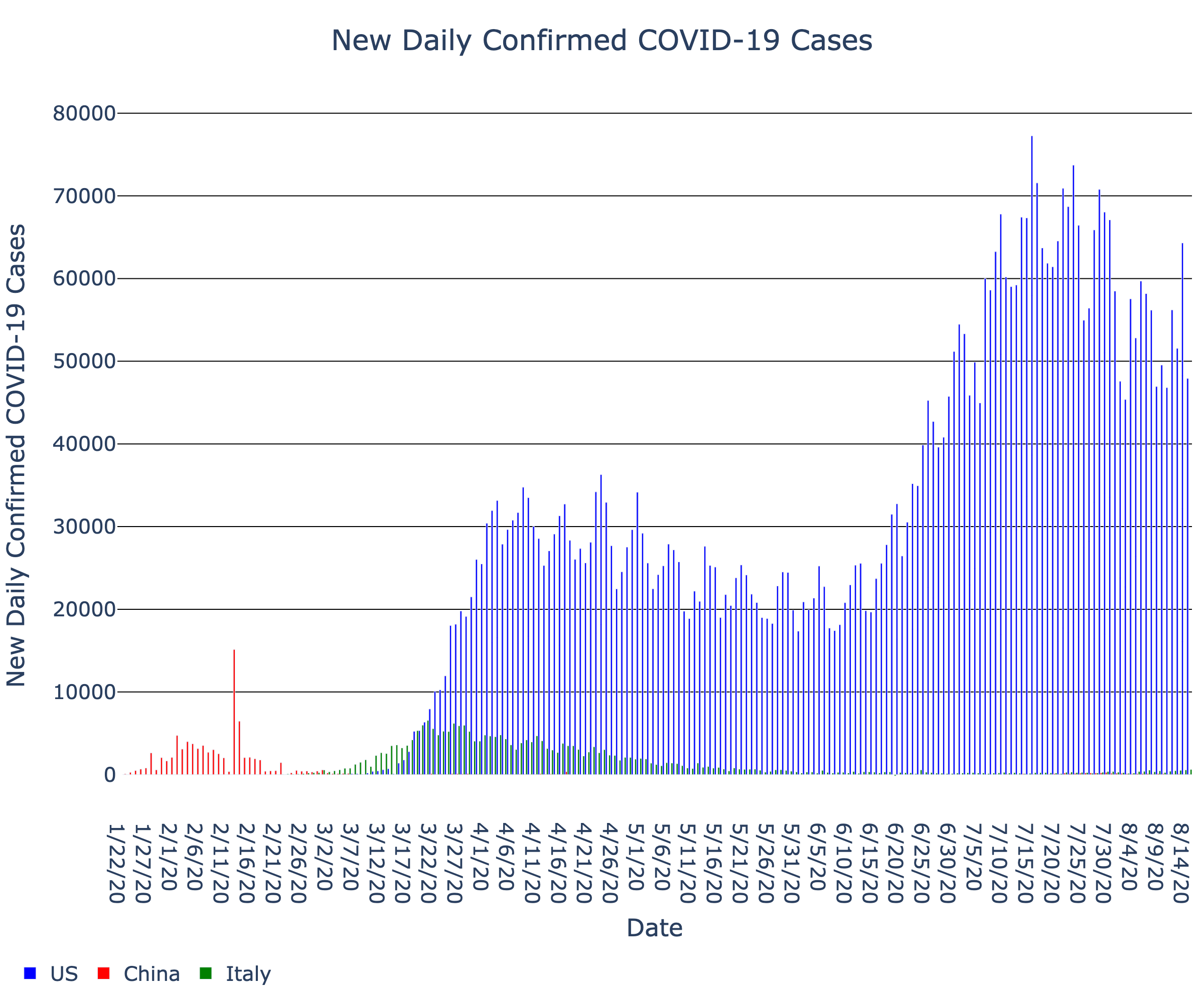
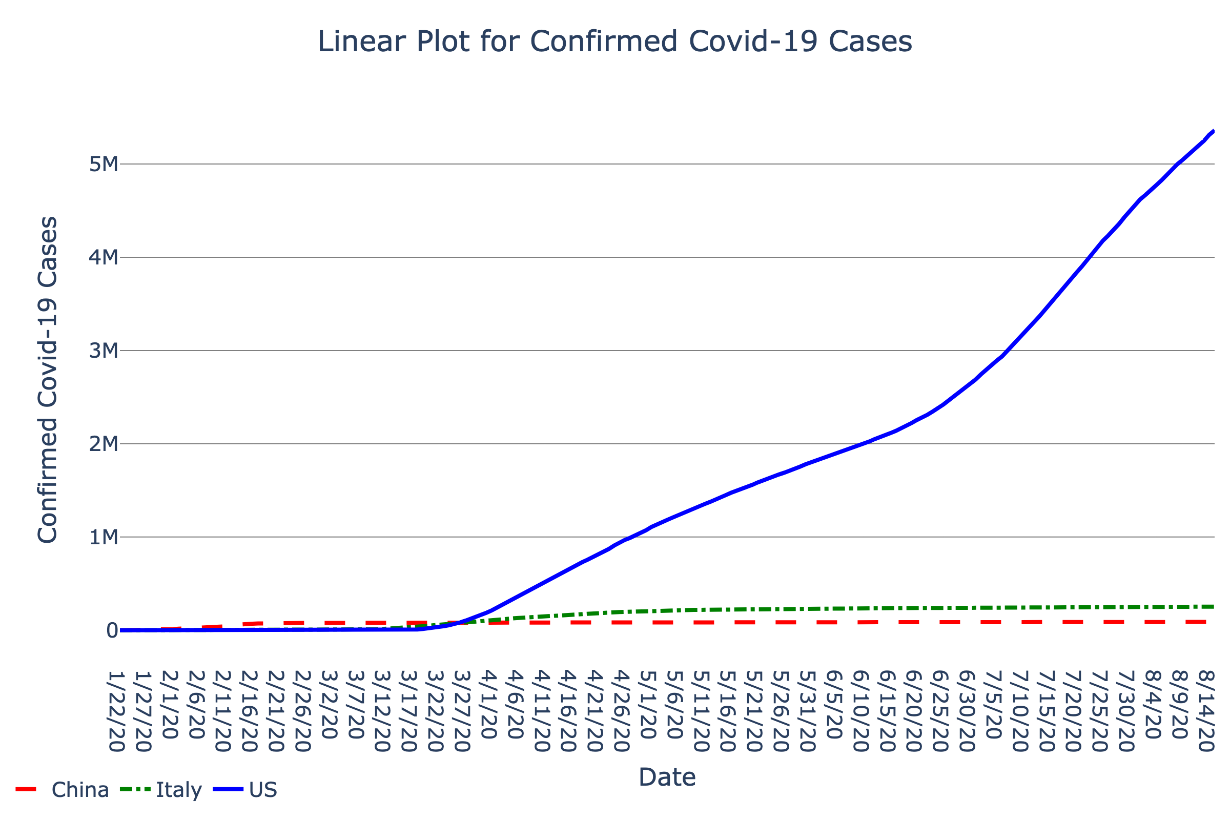
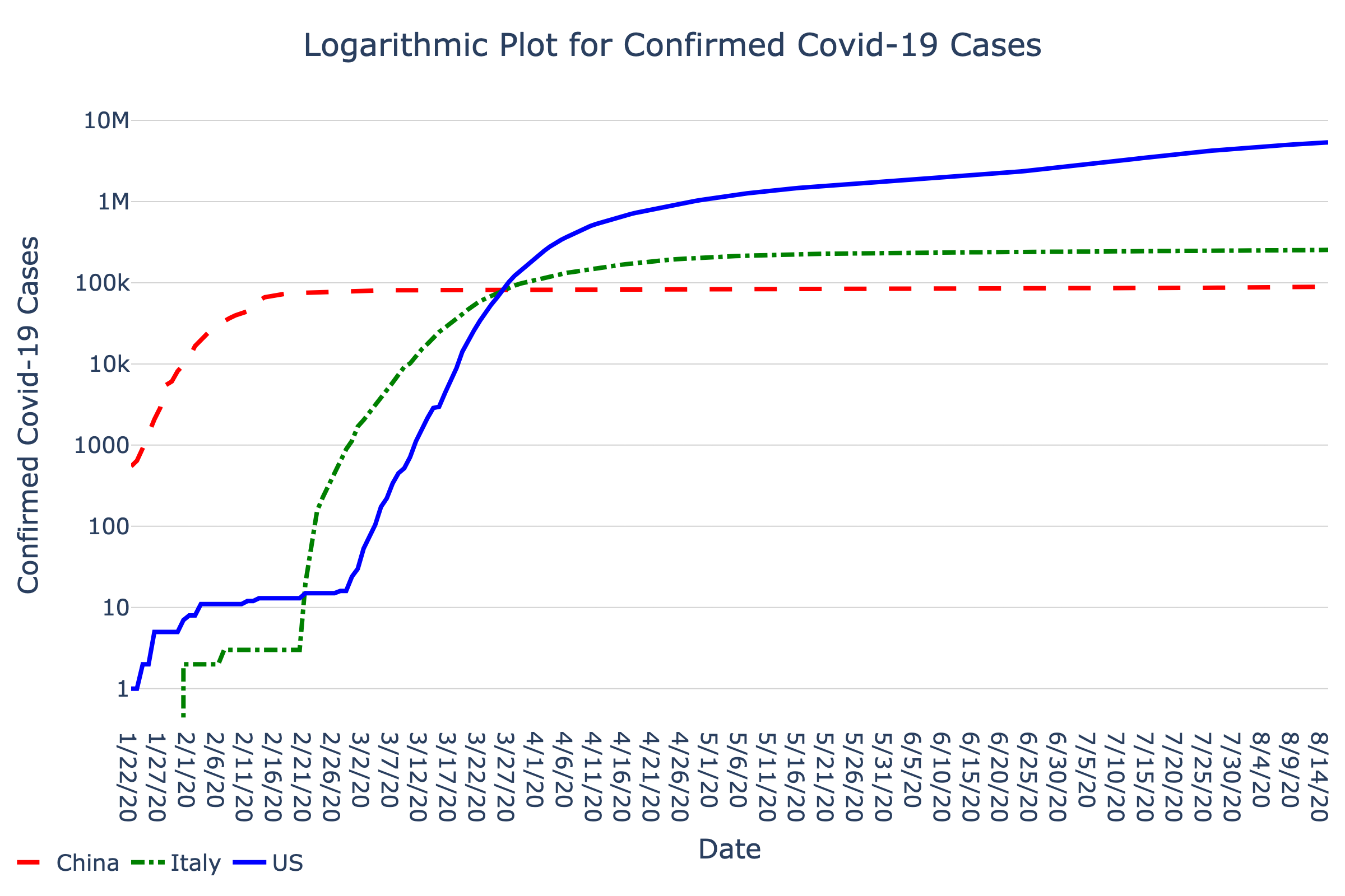
The number of new confirmed Covid-19 cases and total number of confirmed Covid-19 cases are in graphs below. The data is updated daily with the Johns Hopkins CSSE database.
The first bar graph shows the number of new daily confirmed Covid-19 cases for the US, China, Italy.
The second arithmetic graph shows how the number of confirmed Covid-19 cases (y-axis) evolve over time (x-axis) for Italy, the US, and China. People are generally much more familiar with arithmetic graphs, where the x-axis and y-axis values are linearly (and equally) spaced apart. Arithmetic graphs are often used to visualize absolute changes over time. While scrolling through dates on the x-axis, the absolute number of cases on a day corresponds to the height of the corresponding curve on the y-axis. A straight line trending upwards indicates a constant growth of confirmed cases over time, whereas an upwards curving line indicates an accelerating growth of confirmed cases over time.
The third semi-logarithmic graph also shows how the number of confirmed Covid-19 cases (y-axis) evolve over time (x-axis) for Italy, the US, and China. Semi-logarithmic graphs are often used to visualize relative changes or percent changes over time. Equal distances in height correspond to equal ratios of confirmed cases in the semi-logarithmic graph. If the number of confirmed doubled each day, the graph would show a straight increasing line, and if the number of confirmed cases tripled each day, the graph would show an even steeper straight increasing line. In other words, the slope of the curve (change in confirmed cases over the change in time) is related to how quickly the confirmed cases multiply.
How to Explore This Graph With SAS
Use keyboard shortcut G to cycle between countries (US, China, Italy). Set the Speech setting (Keyboard Shortcut C) to Terse. Use Keyboard Shortcut V to cycle between Scan and Explore mode. Use the right/left arrow keys to sweep left and right along the x-axis of the graph. Use keyboard shortcut S to cycle between chord and melody.
Access to the multimodal presentation of this graphic requires use of SAS Graphics Accelerator. If you're not familiar with SAS, read instructions on installation and use.
- Install the SAS Graphics Accelerator for Google Chrome from the Chrome Web Store.
-
Follow these steps to enable SAS Graphics Accelerator to access local files:
- Press Alt to move focus to the Chrome menu.
- Use the arrow keys to navigate to More Tools > Extensions and then press Enter to open the Extensions page.
- Activate the Details button for SAS Graphics Accelerator and enable the "Allow access to file URLs" toggle button.
- Reopen this page in Google Chrome
- Activate the Accelerate button within the graph
Have a question about this graph?
Tell us what question you have and what modality you used to explore the data (audio, visual, both). Human volunteers will provide answers. We will post answers here after May 30 or you may provide an email to receive an alert when your question has been answered.
Browse the Dataset
Articles in the Media
- What’s a logarithmic graph and how does it help explain the spread of COVID-19?. World Economic Forum. Sean Flemming. (2020 April 03).
Last Updated: June 9, 2020