Supporting Non-Visual Data Sensemaking for Blind and Low Vision Users Using Touch and Sound
Department of Mechanical Engineering
Advisor: Sean Follmer
Committee: Sile O'Modhrain, Allison Okamura, Hari Subramonyam, Chris Chafe
Date: November 3, 2025 @ 1:30pm PT
Location: Stanford Building 520, Room 121
Join Via Zoom Passcode: 921110
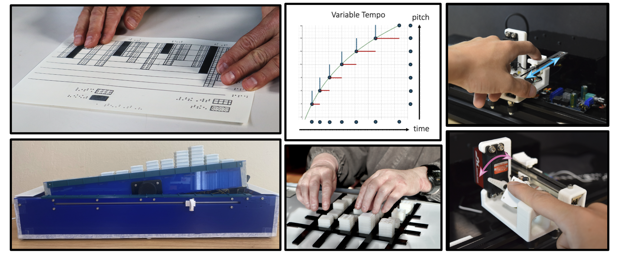
Visualizations such as graphs and charts have become an essential way to communicate and reason about complex data. Yet their benefits often exclude people who are blind or have low vision (BLV). This talk explores how sound and touch can make data more accessible and meaningful for BLV individuals. I begin by examining current practices and lived experiences in accessing visualizations non-visually, highlighting both the promises and the challenges of existing approaches. I then present two new data exploration systems that leverage the unique strengths of haptic and auditory perception to enable richer and more accurate interpretations of data. For haptics, I explore how surface contact can convey data shape and structure. For audio, I use tempo to represent slope and accerelation. Finally, while learning plays an important role in data understanding, current practices for teaching data and statistical literacy rely on visual techniques that exclude BLV students from fully engaging with underlying concepts. Through an extended co-design of interactive and multimodal data learning tools and activities, I reflect on how close collaboration with critical stakeholders can lead to systems that are not only functional but also engaging and empowering. Collectively, this work reimagines how people can experience and learn from data beyond sight to broaden participation in how we understand and communicate with data.